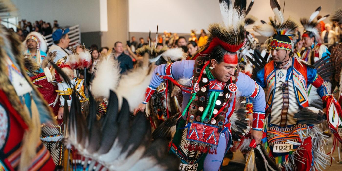
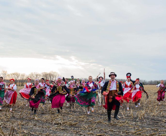
Pow wow dancers gathering for a traditional dance.
Brand Identity
Manitoba’s tourism logo and visual identity is bold and confident while maintaining a warm, approachable personality. Here’s how we bring it to life.

Our primary logo features soft corners and wide letterforms, and it’s set in a bold red that radiates the warmth and energy of our province. A polar bear silhouette illustrates our unique tourism offering and the curiosity and courage inherent in traveling to this vast, wild place.

This logotype is the primary representation of our brand.

Secondary Logos

Tagline Lockup

The Canada’s Heart is Calling tagline reinforces our brand message and provides a call-to-action.

Stacked Logo

We use the stacked version of our logo for unique creative applications, such as apparel or merch items. It’s good for folks who already know the correct spelling of our province’s name—like our fellow Manitobans and Canadians.

Manitoba stacked logo - on sweatshirt

Manitoba Merchandise

Shop our new merchandise lineup and explore our collaborations with local makers.

Shop Manitoba

Supplementary Marks

We have a range of supplementary marks and graphics to help support our logo family and create a visual theme for Manitoba.

MB Avatar

The MB Avatar is the most compact representation of our brand. We use it in small applications where space is limited.

MB Avatar use case - identified in sample Instagram post

MB Badge

Our MB Badge contains letterforms from the logotype and a location pin containing a north star shape—a visual thread you’ll see in other brand elements. We use this mark when we need a responsive version of our primary logo.

Rdd MB Badge on a white baseball cap.

Hunt Fish MB

We have a special mark to celebrate the popularity of Manitoba’s hunting and fishing experiences. We use these marks when communicating with hunters and anglers across the country and around the world.

Location Pin

When we want to highlight an experience in photos and videos, we add our North Star location pin. By pairing it with the destination’s name and corresponding coordinates, we can show audiences where to find the featured experiences.

Manitoba location pin sample, with geo co-ordinates

Tagline Treatment

We have a special treatment to draw attention to our brand tagline: Canada’s Heart is Calling. It visually tells our brand story. We use it at larger sizes, such as murals and large decals.

Manitoba brand on shopping bag - red on white.

Brand Typography

Primary Typeface: Neue Haas Unica

Our primary font is a versatile type family called Neue Haas Unica. Described by type enthusiasts as “Helvetica with a soul,” it maintains a sharp, clean aesthetic and just enough personality make it warm and approachable.

Display Font: Vesterbro

Display typography should entice readers and establish a mood. With its friendly, organic shapes and supple curves, Vesterbro does just that. We use it sparingly and treat it as a graphic element.

Display font, Vesterbro.
Font hierarchy

Brand Palette

Primary Colours

Our primary colour palette reflects our province’s warmth, energy and welcoming spirit. We use them to establish and maintain brand recognition.

Secondary & Neutral Colours

Our secondary colours complement the energy and richness of the primary palette. The vibrant and deep shades of each hue create a robust suite of colours with several high-contrast options. We use these colours to supplement the primary palette.

Brand Photography

Our photography conveys emotion and authenticity while showcasing our tourism offering. Our photography comes from many sources—professional photographers, influencers and everyone in between. There, we have a robust and eclectic image library at our fingertips.

Iconic Experience

These professionally-shot images illustrate the iconic experiences travellers from across the globe can expect to have in Manitoba. We choose images that include people to showcase our welcoming, heart-driven brand aesthetic.

Focus on Emotion

We balance our iconic photography with real, raw and emotive images that call travellers to take in all our province has to offer. The focus in these photos is less on a specific location or experience and more on the feelings they conjure within us.

Provincial Brand Shapes

By combining simple shapes, we can showcase Manitoba’s notable locations, exciting experiences and iconic sights in a fun, accessible way.

Get More Info

Contact Travel Manitoba to request a logo package or additional branding materials.